
One of the most exciting parts of designing a brand or re-branding is picking a color that will appeal to your potential or already existing unique audience. And research continues to be done on color psychology to seek to explain how people’s behavior is influenced by different brand colors palettes.
Color is one way that showcases intentions, character and worth. And therefore, it’s important to learn how to create a color palette for your brand that reveals more about your business. But, first it’s important to know the perception.
What color connotations and associations do you want your customers to have concerning your brand? How do you want them to feel when they see your brand logo?
Do you want to convey professionalism? Or trust or perhaps loyalty? Do you want to come out as a playful brand that’s bold and energetic?
These are the perceptions that your brand color palette can send to your consumers. And for this very key reason, you don’t want to be sending mixed signals that negate your brand’s intentions and motive.

So, finding your sweet spot aesthetically as a brand can mean playing along the current trends happening around you. But this is not to say that you hop onto any color simply because it’s trending and you want to fit in and be fashionable for five seconds. Rather you should consider your brand’s identity as your true north.
Only after you learn more about colors and how they work, you can employ this knowledge to get the most out of your brand color palettes and gain more mileage even from the styled stock photos that you’ll pick.
The Ideal Hue for Brand Color Palette
When picking a brand color palette there are ideally three colors you should consider for your scheme. These are a base, an accent and a neutral one.
They each have a purpose.
The base will act as the dominating trait that will be used the most. The accent one on the other hand will be considered as an accessory that will be the second most used. And finally, the neutral is often used as the background color. You’ll read more about this below.
Being able to successfully pick this brand color palettes can be a puzzle that will require critical and futuristic thinking about your message to the consumer. And about your business and product. And these should guide the trajectory of the aesthetic scheme and style that you end up with.
In short, it’s your intention as a brand followed by your consumers that will define your brand color palette.
What’s a Brand Color Palette?
This can be considered a visual experience that you offer your consumers while showcasing your message and unique personality through color.
The right color selection ensures that you are attractive as a brand, and it also determines how consumers will interact with you and your products.
Why Is Picking the Right Brand Color Palette Important?
Your brand color is the first thing that consumers see. It’s the very first impression they get about your brand. And it instantly conveys a certain message and elicits certain emotions and feelings in consumers long before they know what you’re all about. Plus, it can make them choose whether they want to interact with you further or not.
As said, color psychology research has been ongoing and so far, it has shown how colors affect consumer behaviors and perceptions. And how brands can leverage on this in both banding and marketing. Studies have shown that the initial impression is conveyed and influenced by colors in a proportion of up to 90%. Plus, colors play a huge role on the purchase decision, they have a whopping 85% influence. And this goes out to show why getting your brand color palette right is very important.
What Do Colors Mean? – How to Make Your Brand Recognizable and Memorable?
1. Understand Color Meaning
The first step is to understand what the common colors mean. Below is a quick sum-up:
Blue – It’s associated with trust and reliability. It’s also calming and sometimes can be linked to depression.
Red – It’s associated with danger, but also love and passion, as well as excitement.
Yellow – It’s optimistic, peaceful and happy with a little playfulness.
Green – It’s linked to sustainability, nature and can also demonstrate wealth and prestige.
Pink – It’s feminine, has sentimental connotations and it’s romantic. It has a variation called hot-pink which can be bold and youthful.
Orange – It’s energetic and full of vitality. Can mean fresh, adventurous and creative. And is also linked to cost-effectiveness.
Purple – Shows royalty and majesty with some spiritual and mystery associations.
Brown – Shows organic and wholesome products and it’s also associated with honesty and being down to earth.
White – It shows purity, innocence and minimalism.
Black – It’s sophisticated, luxurious and elegant but can also indicate sorrow.
Multicolor – Captures the spirit of diversity and being open.
These are just a few main colors, but they all have different variations that can accentuate or tone down a color story.
Shades, Tones and Tints
When picking styled stock photos that blend with your brand color palette, it’s important to know the difference between shades, tones and tints and how to use them for an appealing look.
It will also help you when it comes to customizing your stock photos to give you the exact hue you need when arranging your elements in the image.
Shades are created by combining any pure color with black; this makes them darker and often indicates seriousness or masculinity.
Tones on the other hand are created by adding either black or white to a pure color to impact its intensity.
Tints are created by combining any pure color with white to give it a lighter more calm and less energetic and are considered feminine.
2. Understand Your Brand Personality
As shown earlier, you need to know what message you want your brand to convey to all important stakeholders including your consumers and investors.
To help you in this process, note down phrases and words that reverberates with your target market and what you want to be identified with. These descriptions will guide you on the brand identity color palette that you pick.
The next thing will be to consider your brand goals. What are you planning to achieve? Are you offering more knowledge or products to bring happiness to your customers?
Then you also need to think about your target audience, what feelings do you want them to have? Is it maybe confidence or power?
Finally, what words can you use to describe your brand? Is it inspirational or sporty? Or, whatever you consider.
All these questions will help you come up with the right description of your brand personality that will guide you on the brand identity color palette that you pick. And even later when identifying styled stock images that will bring out your message clearly through the right colors.
Identify Your Best Platform
The platform that you will be using will also play a role in your brand color palette selection.
For example, a brand that mainly operates through the website as opposed to a physical store may use different colors as the physical store colors. This is because how an online platform may present these colors will be so different in a physical store.
A simple well-presented styled stock photo can say so much on the internet but may not do as much in a physical store. Factors such as demographics (age of your targeted group) and location can also guide you to know the best platform to use. Therefore, this will dictate your brand color palette selection.
Let Your Color Selection Be Evocative
After you have identified your descriptive words, you can search for shades that resonate with your descriptions.
If your brand’s identity is about inspiring people to stay healthy, fit and energetic, then you’ll select a color palette that has some orange in it and so on.
Let your colors evoke just the right type of feelings to supplement your brand trait. This way, when anyone sees your brand for the first time, they will not get confused as to what you represent, and they will easily remember and recognize your brand.
Apply this as well when picking your styled stock photos. Pick a photo that not only resonates with your description, but also with the correct color palette.
A Formula for Creating a Brand Identity Color Palette
This does not mean it is the only brand color palette generator that works in creating a good color scheme. One can employ many different approaches. However, this formula is simply a guide based on the ideal hue to help you land a working brand color palette.
Step 1 – Choose 3 Colors
Based on your descriptive words above, you can now pick any three colors that will be your base, accent and neutral.
Step 2 – Pick Your Base Color
So, here think about your brand traits, which is the dominant trait?
Your base color should represent your dominant brand trait and be able to appeal to the consumers you’re targeting. It’s also important to remember that once you pick this color the other 2 colors will have to match or compliment this one. You’ll read more about this later.
Step 3 – Pick Your Accent Color
As said earlier, this color will have to serve 2 functions: one – it will have to match your brand personality trait and two – it will have to match with your base color. It must serve all these functions while sending the right message to your audience. So, take your time to get it right.
Step 4 – Choose the Neutral Color
This usually ends up being your background color. It’s often better if it’s subtle to avoid clashing or drawing too much attention. It can be a hue of gray, white or any color that you pick but in the softest hue.
Avoid black as it tends to take over or suck in the other colors and your palette may get lost in it.
A quick note: Throughout this process, keep the end goals in focus to ensure you pick the brand color palettes that will best represent them.
Besides the above formula, there are other effective ways of choosing brand color palette that take a few different approaches. Here they are:
Monochromatic Color Scheme
As said earlier, the colors you pick will be driven by your brand personality trait. Thus, in situations where you have one very dominant trait you want to highlight more, you will use a monochromatic scheme to place emphasis on this trait.
It’s ok to use various hues of the same shade to bring out the minimalist but sleek appeal. Good brand color palette examples with a monochromatic scheme include Netflix which is all red and PayPal who has used 2 spectacular shades of blue.
The only downside of monochromatic scheme is that there is no way of making other elements such as the logo to pop since it’s the same color scheme.
Analogous Color Scheme
This brand color palette uses colors that are next to each other on the color wheel.
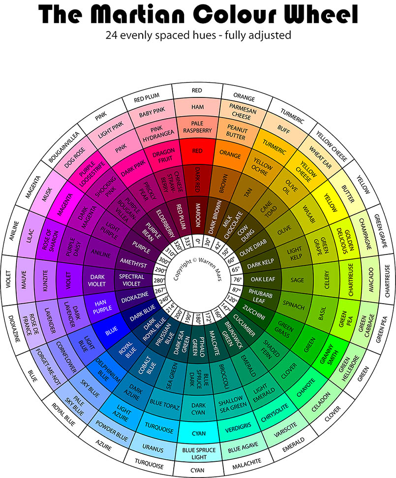
Source: Warrenmars
There is something harmonious about such colors that make them a good option when picking brand color palettes. They seem to give similar emotional implications. MasterCard is one of the best brand color palettes examples for this color scheme.
Source: Logolook
Complementary Color Scheme
This uses color shades that are directly opposite each other on the color wheel and thereby give the sharpest level of contrast. They are great for giving your brand color palette a dramatic look that’s visually very stimulating.
They are great for conveying diverse ideas about your brand’s personality. The best brand color palettes examples for this are Firefox, HubSpot or Visa.
Source: 1000logos
Triadic Color Scheme
This brand color palette picks colors from different parts of the color wheel. It’s tricky but interesting at the same time.
Firstly, they allow for diversity because you can pick just about any shade around the wheel. However, getting the correct blend that represents your brand identity can be a difficult task. The best example is Google or Slack, they both tend to use a variety of colors but they both seem to represent their comprehensive services.
Source: Logos-world
Styled Stock Photo Tip for Complementary and Monochromatic Color Schemes: If your palette is monochromatic, try using styled stock photos with complimentary colors for that very elegant and popping effect. Always use photos with colors that compliment or contrast your brand color palette.
How to Use Brand Color Palettes on Stock Photos
When considering styled stock photos to use for your branding, use one of the following options:
- Pick images that feature less saturated or neutral color palettes then customize them using your brand colors e.g. Logo or Copy.
- Pick images that contain one or more of your brand color palette.
- Pick images with colors that contrast or even compliment your brand color palette.
Conclusion
The journey of searching for a perfect color palette doesn’t end when you find it. It’s a continuous process that requires consistency in use. And repetition is what will help your consumers recognize you. Use your color scheme to guide you when picking styled stock photos. Remember it’s not just about the colors but also the message and personality of your brand.
Use your brand color palette wherever your content goes whether it’s marketing, sales or products to the rest of collateral that you may use. Let it be in your social media platforms and not on your website only. Your brand color palette is your business, it’s your brand. Even when you rebrand, remain consistent with these colors because that’s how your consumers recognize you.